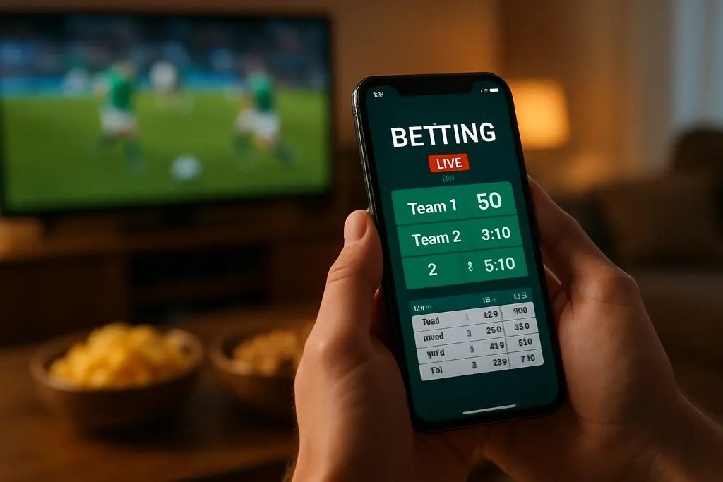
Remember when betting meant a trip to a smoky backroom or a drive to Nevada? Less than a decade ago, sports betting was mostly illegal in the US. Now, it’s a $100 billion-a-year colossus. The arena has officially shifted.
The grandstand is now a six-inch screen. The roar of the crowd is a subtle buzz in your pocket. We’re not just adapting to mobile; we’re designing for a world where it’s the only screen that matters during a live game. This is the undisputed heavyweight champion of the action.
Why? Because the easier it is to find odds, place wagers, and track bets, the more players will do it. Period. A winning mobile sportsbook app focuses on one thing above all: speed. Quick bets. Live updates. Instant action.
This isn’t about mere “responsiveness.” It’s about engineering for moments of peak adrenaline. Think checking odds during a commercial break or placing a last-second prop bet. The digital experience must be the equivalent of a perfect poker face: calm, intuitive, and lightning-fast, no matter how chaotic the game gets.
So, how do you build that? It starts with a seamless sportsbook UX that thinks about wallets, notifications, and fluidity first. Let’s break down the new playbook.
Single Wallet and Instant Transfers
The idea of a single wallet is about feeling connected in a digital world. It’s frustrating when you log into a site and your money isn’t there. It’s like your car keys not working at home.
This unified financial hub should be the calm center of your user’s world. It’s like the financial feng shui of your app. When someone is in the middle of a game, they shouldn’t have to search for their money. The wallet should be always ready, just a tap away.
Payment simplicity is essential, not a luxury. Your platform should support many payment methods, like credit cards and e-wallets. The key is the quality of the experience. Every extra step is a betrayal of trust.
“Instant” is more than a feature; it’s a sign of trust. Quick withdrawals show you’re reliable and value your time. It’s a big psychological win.
The tech behind this is clever. Payment tokenization makes transactions fast and secure. And biometric login makes it as easy as unlocking your phone. This combo makes paying effortless.
The aim is to make the single wallet invisible. With biometric login and instant transfers, it should feel like an extension of your will. Money should be ready to go without a hitch. This isn’t just better payment; it’s building trust.
Deep Linking from Content, Ads, and Notifications
In the world of mobile marketing, deep linking is key. It connects your content, ads, and notifications into a smooth user journey. It stops the digital bait-and-switch.
A user clicks an ad for better odds and ends up on your generic homepage. This confusion kills the sale and betrays the user’s intent.
Deep linking is the art of precise user navigation. It removes the guesswork and takes the user straight to the game or bet. Universal links are more advanced, linking the web and your app smoothly.
Think of it as the glue of your marketing world. A news article about a player’s injury should lead to prop bets. A push notification about odds should be a direct link.
This isn’t just a nice feature. It’s the heart of a logical app structure and easy navigation. Your search function becomes powerful, leading to exact pages. Push notifications become direct calls to action.
Let’s look at how it works:
- Content: Blog posts and social media can lead to betting markets. Every mention of a team or player is a chance for a deep link.
- Ads: Paid campaigns on social media or search engines lead directly to the experience advertised. This maximizes ROI.
- Notifications: Alerts for new games or offers must open the app to the right screen. No dead ends.
Understanding the technical side is important. Here’s a comparison:
| Feature | Deep Linking | Universal Links |
|---|---|---|
| Platform Scope | Primarily within the app or to launch the app. | Works across websites and apps (iOS/Android). |
| Setup Complexity | Relatively straightforward, often app-specific. | Requires website association and server configuration. |
| User Experience | May trigger a “Open in App?” dialog, causing a slight friction. | Seamless; directly opens the app if installed, else falls back to web. |
| Fallback Handling | Poor; can lead to errors if app isn’t installed. | Excellent; gracefully degrades to a mobile webpage. |
| Primary Use Case | Internal app navigation and simple campaign links. | Marketing campaigns, web-to-app journeys, and shareable links. |
The benefits are huge. You keep your promises and respect users’ time and intent. Conversion rates go up because you’ve cut out the middle steps. It turns marketing into a respectful conversation with users who are already interested.
Getting it right takes planning. Map your user journeys and identify all entry points. Make sure your app’s navigation is clear and logical. That’s how you create a world where every touchpoint feels intentional, not accidental.
Real‑Time UI: Score Tickers and Mini‑Views
Your app’s interface needs to be like a sports commentator: always ready, quick to share info, and never missing a beat. Fans watching TV get the game’s action in real-time. Your UI’s job is to bridge that gap. It should feel like a live sports broadcast you control.
Score tickers are more than just text. They’re a constant source of game info. They’re like the news on your sports drama. A good ticker gives live scores, stats, and odds changes without taking your focus.
For fans who are distracted, like cooking dinner, the mini-view or widget is key. It’s a small window into the game’s action. Users can track stats and see odds changes without leaving their app. It’s all about quick, focused design.

Creating a visual language that turns data into a story is key. Representing odds shifts with a flash or color change can be more impactful than numbers alone. Stats should be simple and fast to understand, like moving bars or pie charts.
Every visual cue should be intuitive, not instructional. You’re guiding the user’s eyes to the action. A great real-time UI makes the game’s story clear, fast.
In the end, a top-notch real-time UI does the thinking for the user. It filters the game’s chaos and highlights key moments. It turns the phone into an active partner in the live betting experience. When score tickers and widgets work together, you’ve created a broadcast.
Push Timing: Pre‑Game, In‑Game, Clutch Moments
The timing of a push notification can make all the difference. Get it wrong, and you’re just a bother. Get it right, and you’re an exciting offer. It’s not just about sending messages; it’s about understanding human behavior.
Timing is key. We’ll explore how to use it to your advantage, from building anticipation to creating excitement.
The Pre-Game Buzz: Setting the Stage
Before the game starts, people are ready for something exciting. This is the perfect time to build anticipation. A well-timed push can set the stage for what’s to come.
Think of it like a movie trailer. It gets you excited for the main event. For example, if someone always bets on the Lakers, send them special offers just as the game starts. It’s a way of saying, “We know you love the Lakers, and now’s the time to bet.”
In-Game Dynamics: The Live Pulse
The game is on, and the score is changing. Attention is hard to get and even harder to keep. Your push notifications need to be precise.
This is about sending alerts that match the game’s action. A player fouls out, or a home run changes the game. A push notification can bring this excitement right to your screen. It turns a viewer into a participant at the most exciting moments.
Clutch Moments: The Whisper and the Shout
Then, there are the clutch moments. Fourth and goal, or the bottom of the ninth with bases loaded. Timing becomes an art here.
A push at this moment is like a tap on the shoulder. It’s a chance to be part of history. The message is clear, and the urgency is high. It’s not just a message; it’s a special invitation.
Not every push should be loud. There’s a big difference between loud, broadcast-style pushes and quiet, contextual messages.
Push notifications are for big moments like the game start or a comeback. They’re like shouting in a crowd. In-app messaging, on the other hand, is like a quiet conversation. It’s the special offer that shows up when you’re already looking at bets. It’s the bonus notice in a menu. One grabs your attention; the other deepens your interest.
| Timing Phase | Push Notification Strategy | In-App Messaging Role |
|---|---|---|
| Pre-Game | Event reminders, lineup alerts, personalized offer teasers. | Displaying full promotions details, building hype with countdowns. |
| In-Game: Key Event | Instant alerts for scores, red cards, injuries—momentum shifts. | Offering live bet boosts related to the specific event that just occurred. |
| In-Game: Clutch Moment | High-stakes triggers (final drive, penalty kick) with urgent, simple CTAs. | Providing quick-bet interfaces or last-chance odds directly in the flow. |
| Post-Game | Final score alerts, settlement confirmations, “next match” reminders. | Showcasing replays, stats, and early lines for the next engagement. |
So, what’s the lesson? Your notification strategy is like a clock. Pre-game, in-game, and clutch moments are its critical hours. Push notifications are for the masses. In-app messaging is for those who are already engaged.
Master the timing. Know when to whisper and when to shout. It’s the difference between being welcome and being ignored.
Performance/Latency Budgets for Peak Traffic
Imagine planning for a flash mob that shows up at 8:20 PM on a Sunday. This is peak traffic planning. It’s not just about “scalability.” It’s about making sure your app works perfectly when it matters most.

How long will users wait before giving up? It’s less than the time it takes to microwave popcorn. We aim for loads under two seconds, even when traffic is heavy. This isn’t just tech talk; it’s about understanding user behavior.
Working together and focusing on the user is key. It’s not just about adding more servers. It’s about designing the app to handle big moments. Think of it like preparing for a sports championship.
What happens when the user’s environment fails? Your app must work offline. A user loses signal in a stadium. Does your app freeze, or does it help, caching data and actions? This is more than a feature; it’s a lifeline.
Stress-testing is more than just checking servers. It’s about how users experience your app under heavy load. Can they navigate easily? Does everything update smoothly? This is like a fire drill for your app.
Working together means everyone knows the latency budget. Every update is tested against this standard. It makes scalability real, not just a promise. Your app either works during the critical moment, or it doesn’t.
Managing peak traffic means respecting the user’s excitement. They’re focused on the game, not your tech. Your job is to ensure the only delay is their own decision, not a loading screen.
Accessibility and One‑Handed Controls
Your thumb is the star in live betting. It shouldn’t be forced into awkward positions. Great mobile design focuses on physical ergonomics. It knows you might be holding a phone and a drink at the same time.
Imagine your phone screen divided into zones. Easy actions like view odds, add to slip, place bet should be in the “easy” zone. This lets you use your thumb without changing your grip. It’s essential for using your phone on the go.
Accessibility goes beyond comfort. Features like voiceover and high-contrast modes are key. They make the app clear and useful for everyone. A well-organized menu is not just easy to use; it’s fair.
Offline states are also vital. When you lose signal, your app should help, not hinder. It should show the last odds and slip data.
A good offline state shows cached data and friendly messages. It lets you check your bets. It’s not just a backup; it’s a thoughtful design.
Handling offline states well keeps users happy. It keeps them informed, even when you’re not. This builds trust and keeps them coming back.
When designing, think about one-handed use. Can every tap be made with one thumb? Does it work when there’s no signal? If yes, you’ve created something special. It’s a platform that understands life’s challenges.
QA Checklists and Release Cadence
Every live bet on a phone goes through a detailed quality assurance process. This work is often unseen by users, which is exactly what’s intended. A buggy betting app launch is a major disaster, not just a small mistake.
Quality assurance and a smart release plan are key. They make a betting app reliable and trustworthy, not just a short-lived novelty.
Your QA checklist is like the app’s immune system. It must be thorough and executed carefully before the app goes live. This checklist checks everything, from payment security to how the app works on different devices.
This process isn’t a one-time thing. A good development process means regular updates and growth. But each update needs the same careful testing.
| Checklist Category | Critical Test Focus | Pass/Fail Criteria |
|---|---|---|
| Payment & Security | End-to-end encryption test; failed transaction handling; wallet balance sync. | Zero financial data exposure; all failures have clear user messaging. |
| Live Feature Integrity | Score ticker data latency; in-play bet slip updates; push notification accuracy. | Data delay |
| Cross-Platform & OS | UI rendering on 10+ device models; one-handed control functionality; background app refresh. | Consistent UX across all specified devices; all core features accessible with thumb. |
| Performance Under Load | App stability with 10k concurrent users; API response times; battery consumption. | No crashes; sub-2-second API response; battery drain within acceptable limits. |
This table is more than just a checklist. It’s your guide to avoiding big problems. Focusing on both compliance and new features is important. But the app must work well, too.
Release timing is also key. The market changes fast, but users’ trust is delicate. Releasing updates regularly helps improve the app without overwhelming users.
The last important step is A/B testing. This is where you stop guessing and start making decisions based on data. Does a green “Bet Now” button work better than a red one? Does a simpler bet slip increase conversions? A/B testing answers these questions.
Think of A/B testing as the scientific method for improving your app. You test a hypothesis, see how users react, and then make changes based on the results. This approach makes every detail count.
This cycle of thorough QA, regular updates, and A/B testing creates a high-quality app. It turns your app into a reliable, growing product. The goal is to build trust with every update, season after season.
Privacy and App Store Rules
Even the best betting app UX can fail if it breaks app store rules. It’s a mix of design and strict laws.
KYC and AML checks are essential. The goal is to have as few fields as possible. Developers work with places like the Malta Gaming Authority and UK Gambling Commission. They make compliance a positive feature, not just a rule.
Keeping up with app store rules is ongoing. Apple and Google change their gambling policies often. Privacy-by-design helps meet GDPR and CCPA. Being open about data handling builds trust with users.
The real test of your app isn’t just speed or easy controls. It’s passing the review process. A great app works well, performs well, and stays on devices. Start with integrity in your code.